Resolution of my major project.
- An exhibition at the Hive, Worcs 11th August -25th August 2022.
- A project specific Website.
- A limited number of zines, one for each series.
Working with my late parents’ analogue photo archive my major project investigates the changing context of snapshots, how their meaning evolves and alters over time. Abstract concepts, time, materiality and loss are explored. To share the work widely Paper Memories exists in various formats, both physically and virtually, each with slightly different content. Making decisions as to how I disseminated my body of work, what to include or exclude, were determined by the presentation mode.
Paper Memories: Solo exhibition at The Hive 11th August-25th August 2022.
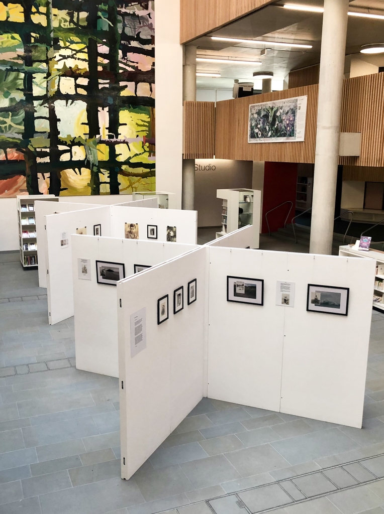
The Hive is a joint public and university facility in Worcester City Centre with a large footfall and long opening hours (7 days a week 8.30am -10pm).
As suggested by my tutor I have reflected on the main strengths and challenges of my exhibition experience, and what I might do differently next time…notes in blue.


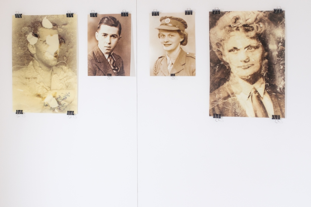
I enjoy printing my own images and wanted total control over paper choice, size etc. so I made the decision to print all my own work, with the exception of the silk fabric prints. I did consider having a different style and /or colour frame for Hireth and Frozen (in time) but decided against this. All the frames were made to measure in black wood with an antique finish in differing sizes. I created 4 new montages that incorporate conceptual elements of both my series. Although conceptually different I needed the two series to flow as a single body of work within the exhibition space. Following assignment 2 my tutor advised me to work towards keeping in mind the idea of the two projects as a single body of work.
Having experimented with Awagami paper before I knew it was perfect for my Frozen (in time) series (despite being costly). All the A3+ images were printed full-bleed with Kozo (thin)70 gsm Natural whilst I printed the A4 images full-bleed on either Kozo (thick) 110gsm Natural or Premio Unryo 165gsm. The paper has a matt finish and creamy colour with a delicate quality that enhances the images. I wanted a more heavyweight paper for the Hireth montages, which all have a large white border. I chose 350gsm Hahnemuhle Baryta FB paper, the first time I’ve used it, it has a whiter base than other papers I’ve used previously. I was really pleased with the resultant A3 prints, I did initially consider A4 size but was wary of the prints being too small due to the surrounding border.
Challenge: I would have liked the A3+ Frozen (in time) prints to have been larger, perhaps A2 or even A1. However, my printer only prints to A3+ size. My choice of Awagami Washi paper was for aesthetic reasons, I did not intend compromising on this by getting them printed commercially on an alternative paper. Given more time I would try to find and pay an independent printer who would be prepared to print larger scale prints with my choice of paper, which if necessary I would be happy to supply. Again something to consider in the future.
Strength: Undertaking the printing and framing myself despite being incredibly stressful. I feel I made the right choice of photographic papers for each series based on their aesthetic qualities.
Although the majority of images were framed I wanted a selection of my Frozen (in time) prints to be hung from bulldog clips. I had a look at artists who have exhibited work this way and experimented myself to check out the best way to do this despite the tight time schedule I was on… see post here.
The silk fabric prints needed to ‘float’ but I was conscious that they would be in a public space on a display board and could easily be pulled down ! William (my husband) screwed small bulldog clips to the top of a strip of balsa wood which left the bottom free but held the silk securely, it was the perfect solution.
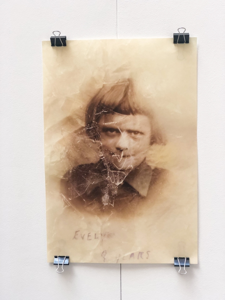
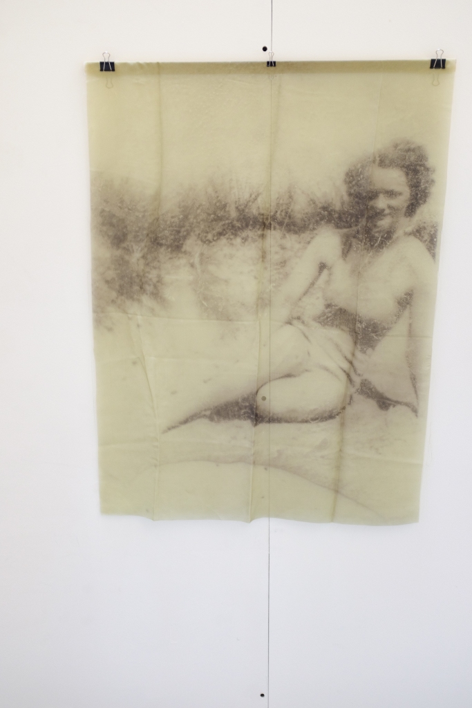


Strength: The Awagami paper and silk fabric prints I used for the Frozen (in time) series drew a lot of interest leading to discussions about the concepts explored. Making the decision to hang from bulldog clips, despite being in a public space and therefore possibly easy to damage or steal, was balanced against allowing visitors to touch them. This was important because the work explores materiality.
Challenge / learning point: I was horrified when the silk prints were hung as there were visible fold marks, particularly noticeable in the one of my dad. However, one visitor I chatted to said she did not feel it was problematic but that it looked as if the silk fabric had been simply unfolded from the green case where my parents’ snapshots are kept. However,I should have ensured they were ironed prior to the exhibition and not folded them in a box to transport them to the Hive !
Strength: Prior planning is both invaluable and essential. I took an A3 sketchbook with the exhibition layout on the set up day so had a clear idea of where all my prints needed to hang and on which board. Recruiting my son in law for the hang was a wise move, he advised me to be prepared for all eventualities. We took a spirit level, tape measure, blue-tack, spare command strips, small steps, plus a dustpan and brush. It took four of us over six hours to set up, this involved a dash to a nearby store to purchase some extra bulldog clips.
Setting up:


Challenge / learning point: I could not have hung the exhibition without my son-in-law who undertook hanging all the work with my husband’s assistance. It is easy to underestimate just what hard work it is and the time it takes. Enlist any help offered, it is easy to become overwhelmed, but something as simple as helping distributing leaflets relieves the burden.
Learning point. I used my iPhone and Fuji X100F to document my exhibition. Unfortunately, they are not the best quality. Furthermore, and much to my horror, all of the photographs on the final day were out of focus… I had left my camera in manual focus mode ! I’ve acted on and taken note of my tutor’s comments below:
- Most of the exhibition images were good but be careful to avoid repetition.
- A few need tidying up a bit, either cropping, straightening or excluding…done.
- All the videos have the same name, either give them individual ones or just use one…done.
- When documenting work in the future use a tripod if possible.
Paper Memories Website.
Home page:

I have amended my website as discussed with my tutor following submission of my final assignment. It will be solely for my OCA major project until after assessment.
Tutor comments:
- The Paper Memories heading was repeated twice.
- Have a projects heading / possibly a sub heading for each series.
- Have as few menu headings as possible.
- Put the About & CV sections on same page not separately (which suggests I am a student).
- These amendments will hopefully make it look more logical and professional.
- Images are good quality on the website…good to know.
The projects section includes the following:
- Hireth.
- Frozen (in time).
- Exhibition images / also includes layout plans
- Multi media
- The green case.
Learning point: My website has undergone many alterations, and will be an ongoing process as I continue on my artistic journey. I will be able to add further projects later on.
My Artist Statement, Bio and CV are now all together in an About section.
Projects page:

ZINES.
My zines can be viewed online, click on the links below:
Learning point: Following the 2nd assignment an interesting point made by my tutor was that whilst it’s important to disseminate the work I needed to consider if a zine is too casual for what my tutor called my ‘fine art’ work.
I chose the paper and size of each zine carefully keeping in mind the concepts explored in each series. The zines were commercially printed by Mixam.
Hireth is A5 size printed in landscape orientation, it can be held easily in the hand. The inside pages are printed with a 170gsm silk paper and have a 300gsm silk cover with matt lamination. The Frozen (in time) zine is A4 size in portrait orientation. I chose a thinner 135gsm paper from the Recycled Natural range for the inside pages as it has a slight transparency and a creamy textured tone, which is perfect for these images. The cover is 250gsm from the same range.
After being offered an exhibition venue I made a decision to limit the quantity available and chose to gift them.
Feedback.
A staff member at The Hive told me my exhibition drew a lot of interest and how it was very different to what is usually on display because it is such personal work. Feedback from my exhibition, zines and website indicated that I had achieved my objective of conveying the poignancy of old photographs and their continuing contemporary relevance. More detailed feedback is documented in my Publication Evaluation in the shared G Drive assessment folder.
LO5 confidently engage a public audience with your practice and analyse, review and evaluate information relevant to your practice, identifying opportunities for professional development.
